Blue the World’s Favorite Color: If you were to walk into a room of strangers and ask them to name their favorite color, you might expect a rainbow of answers. However, statistics suggest a different outcome. Regardless of where you are in the world, the overwhelming majority of people will give you the same answer: blue.
This phenomenon isn’t a new discovery. Scientists and market researchers have been fascinated by our collective preference for blue for over 30 years. From the clothes we wear to the brands we trust, blue dominates our visual landscape. But is this preference simply a matter of aesthetics, or is there a deeper psychological force at play?
Research suggests that our love for blue isn’t random. It is deeply rooted in our biology, our evolution, and the environments we inhabit. Understanding why we gravitate toward this cool hue offers fascinating insights into how the human brain processes emotion, memory, and the world around us.
The Crayola Connection: It Starts in Childhood
Our affinity for color begins much earlier than you might think. In 1993, Crayola—the company famous for introducing children to the world of art—conducted a study to determine the favorite colors of children. The results were telling: the majority of children chose blue or various shades of blue as their top pick.
Lauren Labrecque, a professor at the University of Rhode Island who studies the effect of color in marketing, suggests that color preference is a developmental process.
While we might not be born with a favorite color, we begin to develop affinities the longer we interact with the world.
As children are exposed to their environment, they start building associations. A study involving 330 children aged between 4 and 11 reinforced this idea. The children were asked to draw characters they found pleasant and characters they disliked.
The results showed a clear pattern: children used their favorite colors (often blue) for the “nice” characters and defaulted to black or dark colors for the characters they didn’t like.
This early association between color and emotion sets the stage for adult preferences, suggesting that our “favorite” color is actually a reflection of how we feel about the objects and experiences associated with that color.
The Ecological Valence Theory
Why do we love blue but often turn our noses up at murky browns or greenish-yellows? The answer lies in the “Ecological Valence Theory” (EVT), proposed by researchers Stephen Palmer and Karen Schloss.
According to this theory, colors are not neutral. We do not judge a color in isolation; rather, we judge it based on the objects and experiences we associate with it. We accumulate these associations over a lifetime, creating a mental database of “good” and “bad” colors.
Why we love blue
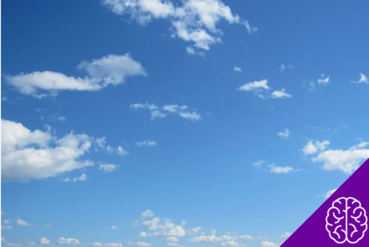
When you think of the color blue, what comes to mind? Likely, you picture a clear sky on a sunny day or a pristine, calming ocean. These are universally positive things. They represent survival, safety, and serenity.
Because most of the blue things in our natural environment are positive, we develop a strong preference for the color itself.
Why we dislike brown
Conversely, the theory explains why dark yellowish-browns are often the least favorite colors among adults. In nature, these colors are frequently associated with rotting food, feces, and biological waste.
Our brains have evolved to recognize these shades as warning signs of things that could make us sick. Therefore, our “dislike” for these colors is actually a survival mechanism.
Essentially, we construct personal and biological reasons to find a shade attractive or repulsive based on what that shade represents in the physical world.
The Physiological and Psychological Impact of Blue
The preference for blue goes beyond simple association; it actually affects how we feel and perceive our surroundings. The color is inextricably linked to feelings of serenity, relaxation, silence, and nostalgia.
The calming effect
Blue is known to have a tangible calming effect on the human body. Certain shades can transmit sensations of coldness, which we associate with ice or cold water. Interestingly, this association is so strong that cold applications are often linked to pain relief.
Spatial perception
Interior designers have long used blue to manipulate how we perceive space. Painting a room blue can make it feel larger and more expansive, mimicking the vastness of the sky. It transforms a cramped bedroom into a relaxing sanctuary.
The language of clothing
Our preference for blue is perhaps most visible in our wardrobes. Jeans, for example, are the most worn pants globally, making indigo one of the most ubiquitous colors in fashion.
Wearing blue sends specific social signals. It makes the wearer appear:
- Confident
- Determined
- Sensible
- Reliable
This is not a coincidence. It is the primary reason why so many uniforms—from police officers to pilots—are blue. It conveys authority and trustworthiness. However, it is worth noting that certain shades can also project a sense of distance or coldness.
The Teenage Shift: A Walk on the Dark Side
While blue remains a favorite throughout life, there is an interesting shift that occurs during adolescence. As children enter their teenage years, their color choices often take a darker turn.
Researchers have noted that teenagers tend to gravitate toward dark, somber tones, moving away from the bright primaries of childhood.
While there isn’t definitive scientific evidence explaining exactly why this happens, it correlates with a period of emotional complexity and identity formation.
However, this “dark phase” is usually temporary. As people transition into adulthood, their color palettes tend to converge again.
The majority of adults return to blue as their preferred hue, while deep brownish-yellows cement their place as the least appreciated colors.
When Blue Becomes Repulsive: Food and Phobias
Despite its global popularity, blue is not universally loved in every context. In fact, there are specific situations where blue is actively avoided.
The blue food paradox
While we love a blue sky, we are generally suspicious of blue food. This goes back to our evolutionary programming. Blue is extremely rare in nature when it comes to edible items.
- Blueberries (which are often purple inside) are a rare exception.
- Mold is often blue or teal.
- Poisonous or bitter substances can appear blue or purple.
Because of this, humans have an innate aversion to blue foods, associating the color with spoilage, intolerance, or danger. We are hardwired to avoid eating things that look like they might be rotting.
Trauma and phobias
Personal experience can override general biological tendencies. While most people find blue relaxing, someone who has suffered a traumatic event involving water—such as a near-drowning experience—might have a very different reaction.
For an individual with hydrophobia (fear of water) stemming from childhood trauma, the color blue might trigger agitation rather than calm.
This demonstrates that while general trends exist, our personal memories play a massive role in how we interpret the visual world.
Cultural Context: It’s Not Just Biology
While the Ecological Valence Theory explains the biological roots of color preference, culture plays a significant role in shaping how we interpret those colors. The “meaning” of a color can change drastically depending on where you are on the map.
Take the color purple, for example. In many European cultures, purple is historically associated with royalty, wealth, and power. However, in parts of Asia, purple is the color of mourning.
These cultural nuances fall under the umbrella of “color psychology,” a branch of study that analyzes how colors influence human behavior and perception. It establishes that colors act as signals to our subconscious, capable of making us happy, sad, relaxed, or alert.
While blue is the global favorite, the specific emotional weight it carries can still be filtered through a cultural lens.
The Verdict on Blue!
The next time you pull on a pair of jeans or admire a clear summer sky, you’re participating in a global psychological phenomenon.
Our love for blue isn’t just a random choice; it’s a complex mix of evolutionary survival instincts, childhood development, and positive associations with the natural world.
From the safety of clear water to the vastness of the horizon, blue represents the things humans need to survive and thrive.
It is the color of reliability, calm, and open space—and in a chaotic world, it makes perfect sense that it’s the one color we all agree on!


